

This feature I will just gab, remark, feature book covers.
For the next month or so .... or however long we see fit. We are doing a Us cover vs. UK other country book covers. I know this has been done before but I think they are fun so we are going to try our hand at it.
So cast your vote for fantasy..... Who wins Us or UK
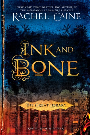
Ink and Bone by Rachel Caine
US Version UK Version
 VS.
VS. 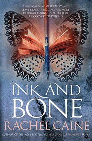
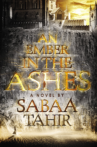
An Ember in the Ashes by Sabaa Tahir
US Version UK Version
 VS.
VS. 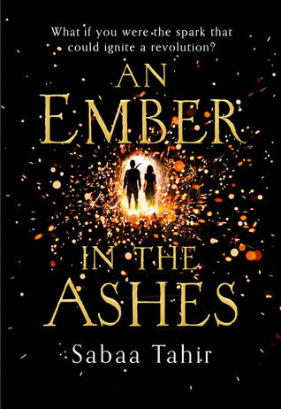
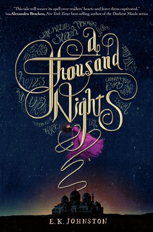
A Thousand Nights by E.K. Johnston
US Version UK Version
 VS.
VS. 
The Queen of Tearling by Erika Johansen
US Version UK Version
 VS.
VS. 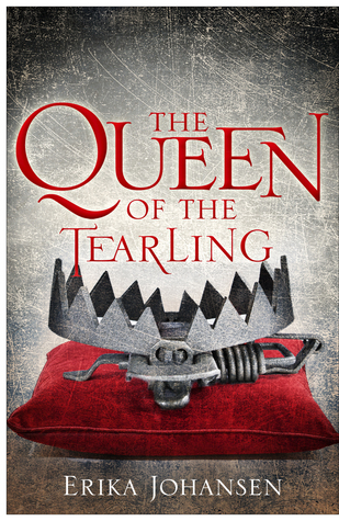
Jenn's thoughts: I really only like one US cover I like better- A Thousand Nights and Ink and Bone
I like the US version of Ink and Bone better, I like the colors, I like that its a library. It makes me think more of the story.
Same with A Thousand Nights. I love the night scene, the colors, what the cover represents. It just goes well with the story. I do like the the colors of the feather though, just doesn't pull me into the story like the other.
UK I like better An Ember in Ashes and Queen of Tearling.
An Ember in Ashes... Well I'm not actually big on either cover but I like the sparkles better than the water in the city?? cover . It may go better for the story I am not sure but I like the sparkles better
Queen of Tearling I Just like the colors of the UK version. Its just I don't know pretty and soft and I like it. Not sure what the trap stands for but I am sure I would understand if I read the book.
Ash's thoughts : I actually fully agree, except for the Queen of the Tearling. I don't like the trap much.
Ink and Bone, the butterfly is just beautiful. The US version, is kind of boring in comparison.
The same thing with An Ember in the Ashes. The colors are beautiful, I love the grey and yellow, but the sparkly book affect of the UK version passes the US version by far.
As for the A Thousand Nights I love the peacock feather, and the beautiful colors of the UK cover, but the US cover is more.. professional looking, I guess, and not so simple. I think it matches with the story a bit better as well.


I actually like the US Covers of all of these way more than the UK ones!
ReplyDeleteKrystianna @ Downright Dystopian