Teaser Tuesday is a weekly meme hosted by Should Be Reading. Bloggers choose two
sentences out of our current read to peak others' curiosity.

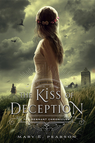
The Kiss of Deception by Mary E. Pearson

In this timeless new trilogy about love and sacrifice, a princess must find her place in a reborn world.
In a society steeped in tradition, Princess Lia’s life follows a preordained course. As First Daughter, she is expected to have the revered gift of sight—but she doesn’t—and she knows her parents are perpetrating a sham when they arrange her marriage to secure an alliance with a neighboring kingdom—to a prince she has never met.
On the morning of her wedding, Lia flees to a distant village. She settles into a new life, hopeful when two mysterious and handsome strangers arrive—and unaware that one is the jilted prince and the other an assassin sent to kill her. Deception abounds, and Lia finds herself on the brink of unlocking perilous secrets—even as she finds herself falling in love.
Top Ten is an original feature/weekly meme created here at
The Broke and the Bookish that features a great bookish top ten every week.
My Top Ten Cover Musts...
1. Large and Clean title
2. Bold and Bright Colors
3. Simple not overdone
4. I like draw or illustrated covers.
5. I am not much with people on the covers
5. I do like people on the cover if they are a girl in a fancy dress
6. I want the cover to tie into the story.
7. I am not much for scenery on the cover ... IE... deserts, beaches, forests...
8. I do like huge flowers on covers... ones that take up the entire cover.
9. I do like old looking, vintage, or ancient looking covers.
10. I can't stand movie tie in covers. Leave the books alone in their original forms......
11. One more for good measure- I hate it when publishers change covers in the middle of the series... really can't we wait until the series is over... all books are out in paperback.. then change them. Quit taking all my money so my books will match on my shelves.

.png)
.png&container=blogger&gadget=a&rewriteMime=image%2F*)
.png)


Nice teaser. I loved this one, hope you are too. :)
ReplyDeleteGreat teaser!! Really want to read this one and should've just requested it from Netgalley when they had it, but I was trying to be "good"!
ReplyDeleteNice picks too! I am totally with you on 11! I HATE that! I don't know what's worse, to change the cover look at book 2 or the last one! I mean it's aggravating either way! I was totally upset when the Immortal Rules changed their covers at book 2 and I was positively devastated upon learning that the Arcana Chronicles were getting revamped with the third and final book! Tragedy indeed!
Here's my Tuesday Post
Have a GREAT day!
Old Follower :)
I've been very curious about The Kiss of Deception! I hope it's good! And I also agree with the cover trends. Illustrated ones are often my favorites. I tend to get bored with the almost kissing or girl in a dress cover to be honest.
ReplyDelete