A new feature I have been thinking about for a while now. I love covers and thought to do a feature just about covers. Of course there will be a cute picture of my grandson to show off too. So this feature I will just gab, remark, feature covers I like or don't like. Anything covers goes. So if you like covers as much as I do. Here ya go.
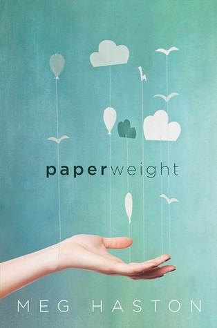
This week I am featuring a cover that is simple but beautiful. I love this cover! What I love are the colors, the paper clouds and birds, the font and the hand. I like it all. It really draws me in right away. It seems the simple covers really work. What do you think about this cover?
Here are some other simple covers that I think stand out..... simple picture with noticeable font.


Your grandson is so cute! All of these covers are gorgeous, and they definitely seem to fit well together. I like these because they are simple but still manage to draw your eye. Paperweight is my favorite because the blue almost reminds me of watercolor because it fades towards the right.
ReplyDeletegoogle 582
ReplyDeletegoogle 583
google 584
google 585
google 586